There are five FAANG stocks, known for their strong upside technical momentum: Facebook (FB), Apple (AAPL), Amazon (AMZN), Netflix (NFLX), and Alphabet (GOOGL).
Alphabet Inc. (GOOGL) set an all-time intraday high on April 29, hitting $1,297. It’s the only FAANG stock to set an all-time intraday high this year. It’s also the only FAANG stock to fall by a bear market percentage in such a short time horizon…
Earnings were released after the close on April 29, and poor guidance began the crash. At the June 3 low of $1,027 the stock was in bear market territory… 20.8% below the high.
Here are several reasons why Alphabet began its slump after setting its all-time high:
- Wall Street analysts were disappointed by a slowdown in ad revenue
- YouTube click growth decelerated more than expected
- Sales of Google’s Pixel smartphones were disappointing
- The company just paid a $1.7 billion fine from the European Commission and was hurt by currency exchange rates
- Investors will now have their eyes on events related to the DOJ investigations
Technical breakdown
For details on how to read the daily chart and its indicators, see the information box below.
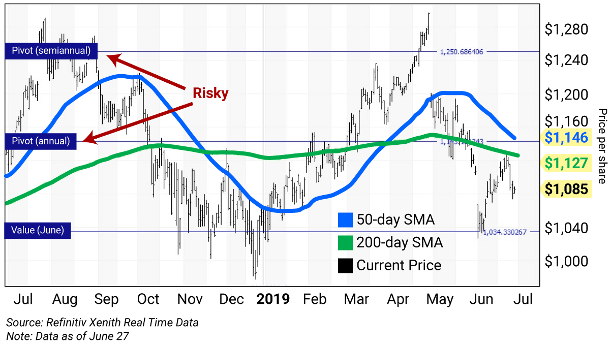
The daily chart for Alphabet shows the stock was on a bull market run of 24.6% from its December 24 low of $978 to its April 29 all-time intraday high of $1,297. Note the huge price gap lower on April 30. This was caused by the factors outlined above.
It’s now trading below its 50-day simple moving average (50-day SMA) of $1,146 and 200-day SMA of $1,127, which is a sign of weakness.
The stock closed December 31 at $1,045, which was the year-end input to my proprietary analytics. Still in play is a semiannual pivot at $1,251 and an annual pivot at $1,143, which are now risky levels.
When I input the May 31 close of $1,103, it resulted in a June value level at $1,034.
Alphabet’s (GOOGL) levels at a glance
Semiannual pivot (risky): $1,251
Annual pivot (risky): $1,143
June value: $1,034
How to use the chart levels
The horizontal lines you’ll see on these charts (value, pivot, and risky levels) help pinpoint buy and sell levels and can help maximize gains and limit losses on stocks you plan to hold long term.
A pivot level is a value level or risky level that was violated within its time horizon. Pivots act as magnets that have a high probability of being tested again before the time horizon expires.
A pivot will often sit about where the stock is trading. But GOOGL’s pivots are now higher—as risky levels.
Today’s value levels and risky levels are based upon the last nine monthly, semiannual, and annual closes.
The first input was the December 31 close. The original semiannual and annual levels remain in play. The weekly level changes each week; the monthly level changed at the end of January, February, March, April, and May. The quarterly level was changed at the end of March.
My theory is that nine years of volatility between closes are enough to assume that all possible bullish or bearish events for the stock are factored in.
To capture share price volatility, investors should buy on weakness around the value level and reduce holdings on strength around the risky level. (You can rebuild your position on weakness.)
Today’s close (June 28) is the second most important close for 2019. I’ll use this input to generate new weekly, monthly, quarterly, and semiannual levels.
Trading strategy
Buy Alphabet (GOOGL) on weakness to $1,034 (monthly value) and reduce holdings on strength to $1,143 (annual pivot).
How to read daily chartsIn these pages, we’ll be using both daily and weekly charts to determine the best price levels at which to add to a position on weakness, or reduce holdings on strength, depending on the term of my analysis. I developed the technical parameters for these charts following the crash of 1987, using rigorous back-testing to come up with a methodology that resulted in the fewest false signals. Daily charts provide a roadmap of how a stock has traded over the last 52 weeks and typically cover a time horizon of a rolling three to five weeks. The daily bars (in black) show the high, low, and close for each day of the last 52 weeks, ending in the current price. The blue line is the 50-day simple moving average (50-day SMA). The green line is the 200-day SMA. These averages show levels of support or resistance as the stock trends higher or lower. (You can read more about SMAs here.) |

 | Rich Suttmeier Founder & CEO, Global Market Consultants |
Editor’s note: We’ve received a tremendous amount of positive feedback on Rich’s Charts of the Day/Week. Please keep sending your questions and suggestions for this new service here.